The gt_plt_sparkline function takes an existing gt_tbl object and
adds sparklines via the ggplot2. Note that if you'd rather plot summary
distributions (ie density/histograms) you can instead use: gtExtras::gt_plt_dist()
Arguments
- gt_object
An existing gt table object of class
gt_tbl- column
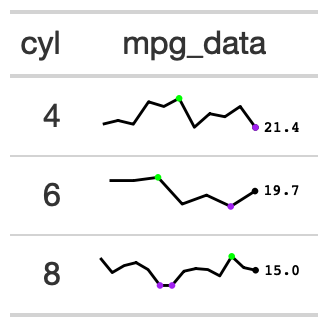
The column wherein the sparkline plot should replace existing data. Note that the data must be represented as a list of numeric values ahead of time.
- type
A string indicating the type of plot to generate, accepts
"default","points","shaded","ref_median",'ref_mean',"ref_iqr","ref_last". "points" will add points to every observation instead of just the high/low and final. "shaded" will add shading below the sparkline. The "ref_" options add a thin reference line based off the summary statistic chosen- fig_dim
A vector of two numbers indicating the height/width of the plot in mm at a DPI of 25.4, defaults to
c(5,30)- palette
A character string with 5 elements indicating the colors of various components. Order matters, and palette = sparkline color, final value color, range color low, range color high, and 'type' color (eg shading or reference lines). To show a plot with no points (only the line itself), use:
palette = c("black", rep("transparent", 4)).- same_limit
A logical indicating that the plots will use the same axis range (
TRUE) or have individual axis ranges (FALSE).- label
A logical indicating whether the sparkline will have a numeric label for the last value in the vector, placed at the end of the plot.
See also
Other Plotting:
gt_plt_bar(),
gt_plt_bar_pct(),
gt_plt_bar_stack(),
gt_plt_dist(),
gt_plt_percentile(),
gt_plt_point(),
gt_plt_winloss()