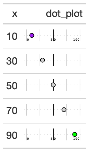
Creates a percentile dot plot in each row. Can be used as an alternative for a 0 to 100% bar plot. Allows for scaling values as well and accepts a vector of colors for the range of values.
Usage
gt_plt_percentile(
  gt_object,
  column,
  palette = c("#007ad6", "#f0f0f0", "#f72e2e"),
  width = 25,
  scale = 1
)
Arguments
- gt_object
An existing gt table
- column
The column to transform to the percentile dot plot. Accepts
tidyeval. All values must be end up being between 0 and 100.- palette
A vector of strings of length 3. Defaults to
c('blue', 'lightgrey', 'red')as hex soc("#007ad6", "#f0f0f0", "#f72e2e")- width
A numeric, indicating the width of the plot in
mm, defaults to 25- scale
A number to multiply/scale the values in the column by. Defaults to 1, but can also be 100 if you have decimals.
See also
Other Plotting:
gt_plt_bar(),
gt_plt_bar_pct(),
gt_plt_bar_stack(),
gt_plt_dist(),
gt_plt_point(),
gt_plt_sparkline(),
gt_plt_winloss()