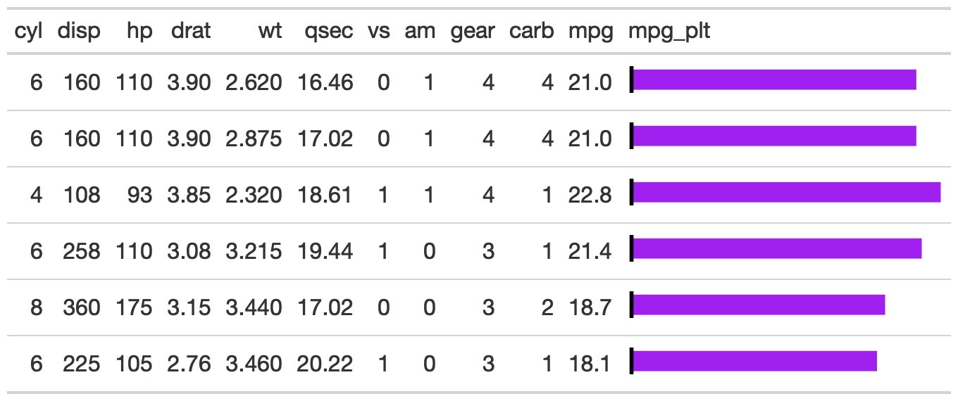
The gt_plt_bar function takes an existing gt_tbl object and
adds horizontal barplots via ggplot2. Note that values are plotted on a
shared x-axis, and a vertical black bar is added at x = zero. To add labels
to each of the of the bars, set scale_type to either 'percent' or 'number'.
Usage
gt_plt_bar(
  gt_object,
  column = NULL,
  color = "purple",
  ...,
  keep_column = FALSE,
  width = 40,
  scale_type = "none",
  text_color = "white"
)
Arguments
- gt_object
An existing gt table object of class
gt_tbl- column
A single column wherein the bar plot should replace existing data.
- color
A character representing the color for the bar, defaults to purple. Accepts a named color (eg
'purple') or a hex color.- ...
Additional arguments passed to
scales::label_number()orscales::label_percent(), depending on what was specified inscale_type- keep_column
TRUE/FALSElogical indicating if you want to keep a copy of the "plotted" column as raw values next to the plot itself..- width
An integer indicating the width of the plot in pixels.
- scale_type
A string indicating additional text formatting and the addition of numeric labels to the plotted bars if not
'none'. If'none', no numbers will be added to the bar, but if"number"or"percent"are used, then the numbers in the plotted column will be added as a bar-label and formatted according toscales::label_percent()orscales::label_number().- text_color
A string indicating the color of text if
scale_typeis used. Defaults to"white"
Examples
library(gt)
gt_plt_bar_tab <- mtcars %>%
  head() %>%
  gt() %>%
  gt_plt_bar(column = mpg, keep_column = TRUE)