The gt_plt_bar_pct function takes an existing gt_tbl object and
adds horizontal barplots via native HTML. Note that values
default to being normalized to the percent of the maximum observed value
in the specified column. You can turn this off if the values already
represent a percentage value representing 0-100.
Usage
gt_plt_bar_pct(
  gt_object,
  column,
  height = 16,
  width = 100,
  fill = "purple",
  background = "#e1e1e1",
  scaled = FALSE,
  labels = FALSE,
  label_cutoff = 0.4,
  decimals = 1,
  font_style = "bold",
  font_size = "10px"
)
Arguments
- gt_object
An existing gt table object of class
gt_tbl- column
The column wherein the bar plot should replace existing data.
- height
A number representing the vertical height of the plot in pixels. Defaults to 16 px.
- width
A number representing the horizontal width of the plot in pixels. Defaults to 100 px. Importantly, this interacts with the label_cutoff argument, so if you want to change the cutoff, you may need to adjust the width as well.
- fill
A character representing the fill for the bar, defaults to purple. Accepts a named color (eg 'purple') or a hex color.
- background
A character representing the background filling out the 100% mark of the bar, defaults to light grey. Accepts a named color (eg 'white') or a hex color.
- scaled
TRUE/FALSElogical indicating if the value is already scaled to a percent of max (TRUE) or if it needs to be scaled (FALSE). Defaults toFALSE, meaning the value will be divided by the max value in that column and then multiplied by 100.- labels
TRUE/FALSElogical representing if labels should be plotted. Defaults toFALSE, meaning that no value labels will be plotted.- label_cutoff
A number, 0 to 1, representing where to set the inside/outside label boundary. Defaults to 0.40 (40%) of the column's maximum value. If the value in that row is less than the cutoff, the label will be placed outside the bar, otherwise it will be placed within the bar. This interacts with the overall width of the bar, so if you are not happy with the placement of the labels you may try adjusting the
widthargument as well.- decimals
A number representing how many decimal places to be used in label rounding. Defaults to 1.
- font_style
A character representing the font style of the labels. Accepts one of 'bold' (default), 'italic', or 'normal'.
- font_size
A character representing the font size of the labels. Defaults to '10px'.
Examples
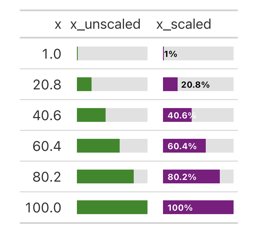
library(gt)

base_tab <- dplyr::tibble(x = seq(1, 100, length.out = 6)) %>%
  dplyr::mutate(
    x_unscaled = x,
    x_scaled = x / max(x) * 100
  ) %>%
  gt()

base_tab %>%
  gt_plt_bar_pct(
    column = x_unscaled,
    scaled = TRUE,
    fill = "forestgreen"
  ) %>%
  gt_plt_bar_pct(
    column = x_scaled,
    scaled = FALSE,
    labels = TRUE
  )
See also
Other Plotting:
gt_plt_bar(),
gt_plt_bar_stack(),
gt_plt_dist(),
gt_plt_percentile(),
gt_plt_point(),
gt_plt_sparkline(),
gt_plt_winloss()