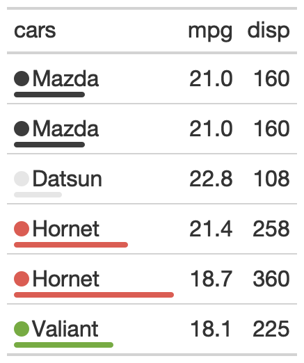
This function takes a data column and a categorical column and
adds a colored dot and a colored dot to the categorical column. You can supply
a specific palette or a palette from the {paletteer} package.
Arguments
- gt_object
An existing gt table object of class
gt_tbl- column
The column which supplies values to create the inline bar plot
- category_column
The category column, where a colored dot and bar will be added
- palette
The colors or color function that values will be mapped to. Can be a character vector (eg
c("white", "red")or hex colors) or a named palette from the{paletteer}package.- max_value
A single numeric value indicating the max value, if left as
NULLthen the range of thecolumnvalues will be used