03 - Plots, Graphics, and tables
Layout
::: {#fig-dogs layout-ncol=2}
{#fig-sleep}
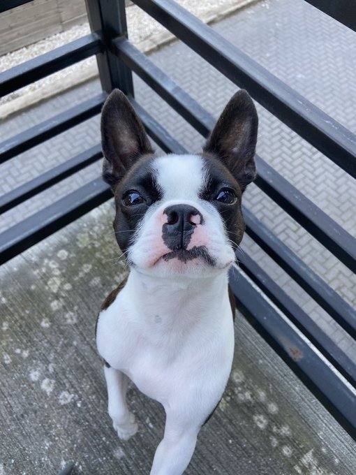{#fig-awake}
The two states of Howard.
:::Layout


Figure panels
::: {layout-ncol=2}

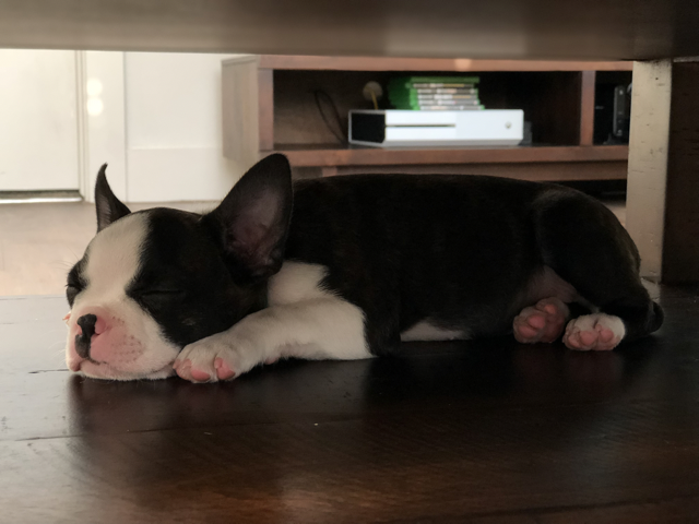
:::Multiple rows
::: {layout-nrow=2}


:::Figure divs
You can treat any markdown content you want as a figure by enclosing it in Pandoc div block with an identifier prefaced with #fig-. For example, here we create a figure that includes an embedded iframe:
::: {#fig-elephant}

<iframe width="560" height="315" src="https://www.youtube.com/embed/SNggmeilXDQ"></iframe>

Elephant
:::Your Turn
- Open
quarto-workshop/07-static/figure-layout - Swap between row and col layout
Custom Layouts
Read [[1,1], [1]] as:
Row 1: two equal sized images each taking up half of the column
Row 2: one image, taking up the entire column
::: {layout="[[1,1], [1]]"}


:::
Custom Layouts
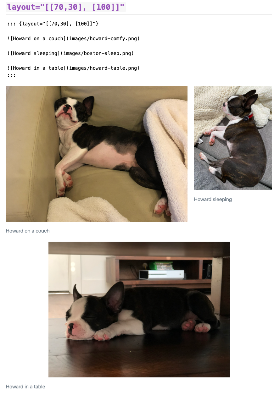
Read "[[70,30], [100]]" as:
Row 1: two images, taking up 70% and 30% of the column
Row 2: one image, taking up 100% of column
::: {layout="[[70,30], [100]]"}


:::
Custom layouts
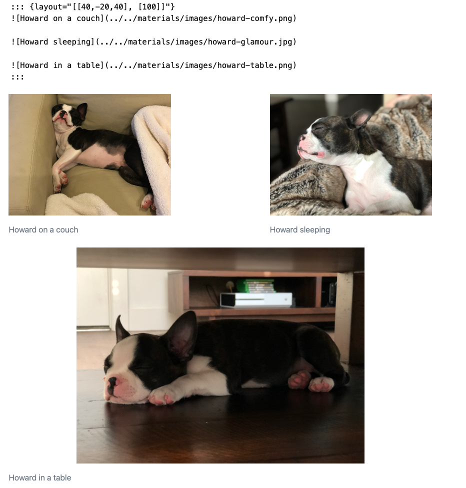
You can also add negative values for “blank space”
[[40,-20,40], [100]]
Row 1: 40% image 1, 20% blank, 40% image 2
Row 2: 100% image 3
::: {layout="[[40,-20,40], [100]]"}


:::
Custom layouts, vertical
If images within a row are of differing heights, you can control vertical alignment.
{layout="[25,-2,10]" layout-valign="bottom"}
Row: 25
::: {layout="[25,-2,10]" layout-valign="bottom"}


:::
Your Turn
- Open
quarto-workshop/07-visuals/figure-layout2.qmd
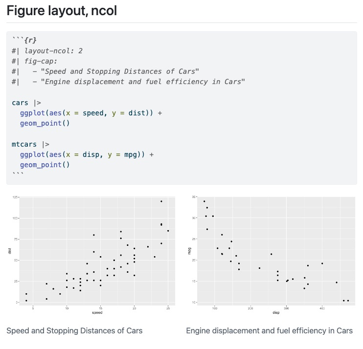
Figure layout
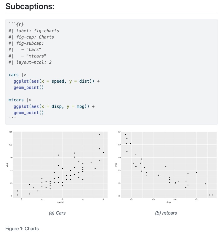
Figure layout, subcaptions
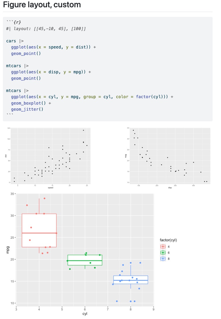
Figure layout, custom
Your Turn
- Open
quarto-workshop/07-visuals/plot-layout.qmd - Explore, try it out and render
Block layout, arbitrary content
::: {layout-ncol=2}
## List One

- Item A
- Item B
- Item C

## List Two

- Item X
- Item Y
- Item Z
:::
Block layout, arbitrary content
List One
- Item A
- Item B
- Item C
List Two
- Item X
- Item Y
- Item Z
Block layout, arbitrary content
::: {layout-ncol=2}
- Item X
- Item Y
- Item Z

Lorem ipsum dolor sit amet, consectetur adipiscing elit. Curabitur gravida eu erat et fring. Morbi congue augue vel eros ullamcorper, eget convallis tortor sagittis. Fusce sodales viverra mauris a fringilla. Donec feugiat, justo eu blandit placerat, enim dui volutpat turpis, eu dictum lectus urna eu urna. Mauris sed massa ornare, interdum ipsum a, semper massa.
:::
Block layout, arbitrary content
- Item X
- Item Y
- Item Z
Lorem ipsum dolor sit amet, consectetur adipiscing elit. Curabitur gravida eu erat et fring. Morbi congue augue vel eros ullamcorper, eget convallis tortor sagittis. Fusce sodales viverra mauris a fringilla. Donec feugiat, justo eu blandit placerat, enim dui volutpat turpis, eu dictum lectus urna eu urna. Mauris sed massa ornare, interdum ipsum a, semper massa.
Grid, custom layout
The “grid” layout in Quarto is 12 units wide - you can break up the grid into different subsections as long as they add up to 12.
This column takes 1/3 of the page 
This column takes 2/3 of the page 
Your Turn
- Try out the grid layout in the previous slide, modifying the
.g-col-8to add up to a total of 12 - Create a new Quarto doc
Article Layout
Quarto supports a variety of page layout options that enable you to author content that:
- Fills the main content region
.column-body - Overflows the content region
.column-body-outset - Spans the entire page
.column-page - Occupies the document margin
.column-margin
Your Turn
- Open
quarto-workshop/07-visuals/plots.qmd - Try modifying the layout with
::: {.column-???}syntax
ggplot2
ggplot2
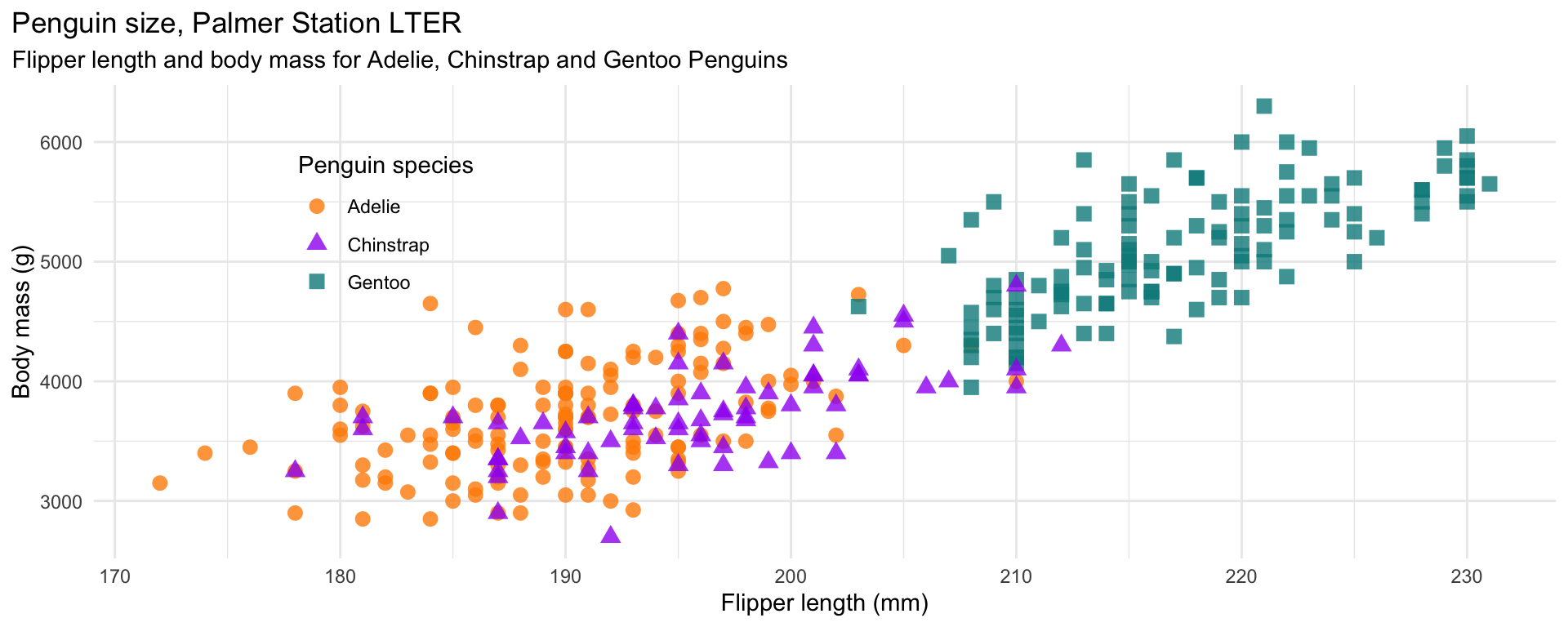
mass_flipper <- ggplot(data = penguins,
                       aes(x = flipper_length_mm,
                           y = body_mass_g)) +
  geom_point(aes(color = species,
                 shape = species),
             size = 3,
             alpha = 0.8) +
  scale_color_manual(values = c("darkorange","purple","cyan4")) +
  labs(title = "Penguin size, Palmer Station LTER",
       subtitle = "Flipper length and body mass for Adelie, Chinstrap and Gentoo Penguins",
       x = "Flipper length (mm)",
       y = "Body mass (g)",
       color = "Penguin species",
       shape = "Penguin species") +
  theme(legend.position = c(0.2, 0.7),
        plot.title.position = "plot",
        plot.caption = element_text(hjust = 0, face= "italic"),
        plot.caption.position = "plot")
ggplot2

ggplot2

ggplot2
ggplot2
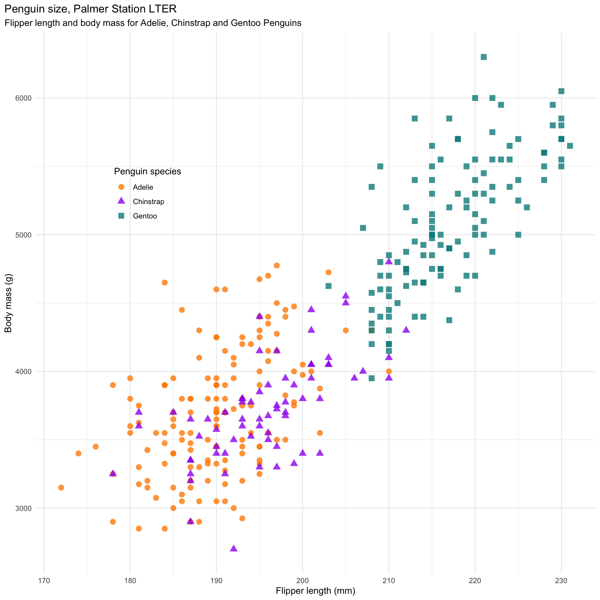
ggplot2
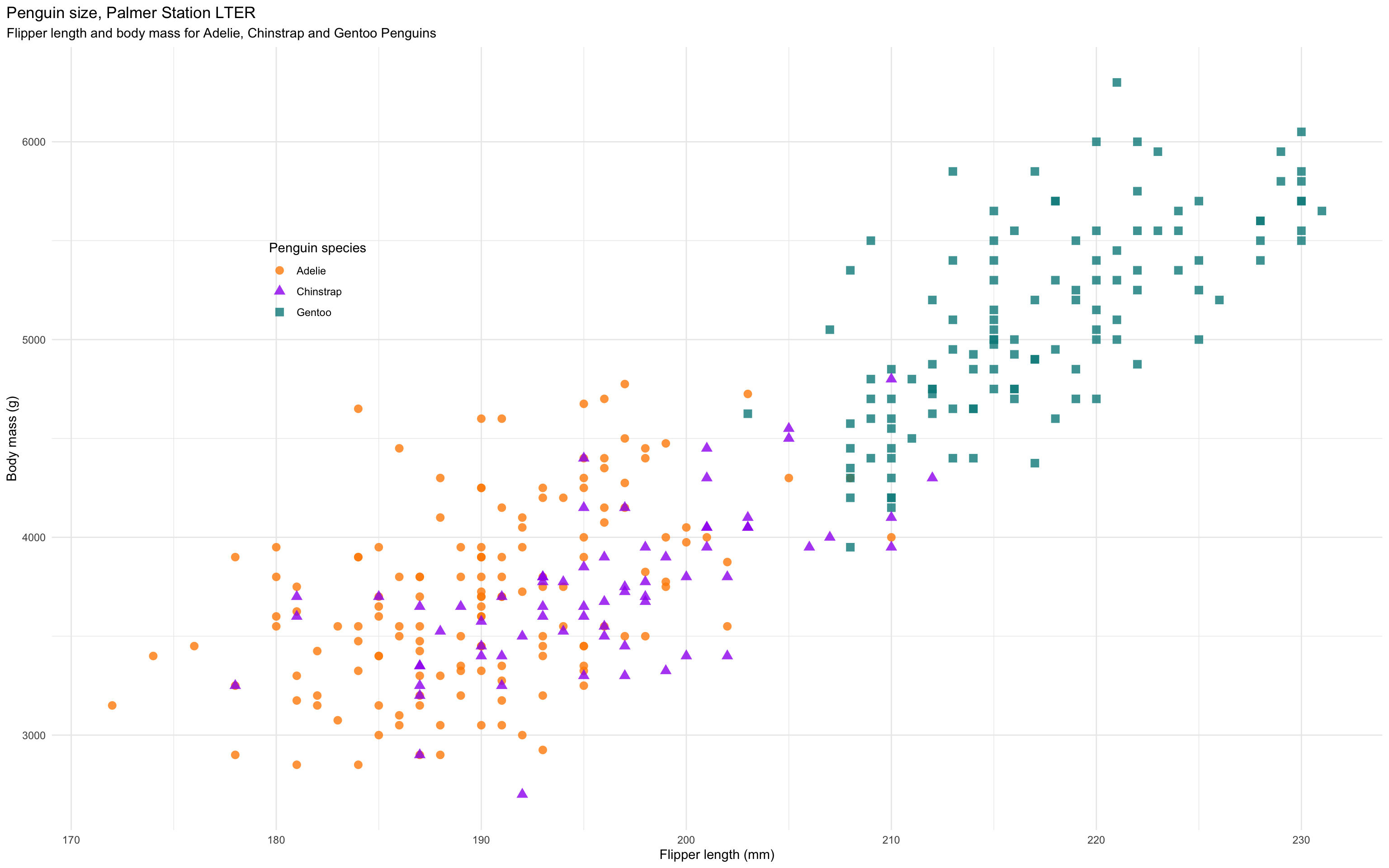
ggplot2
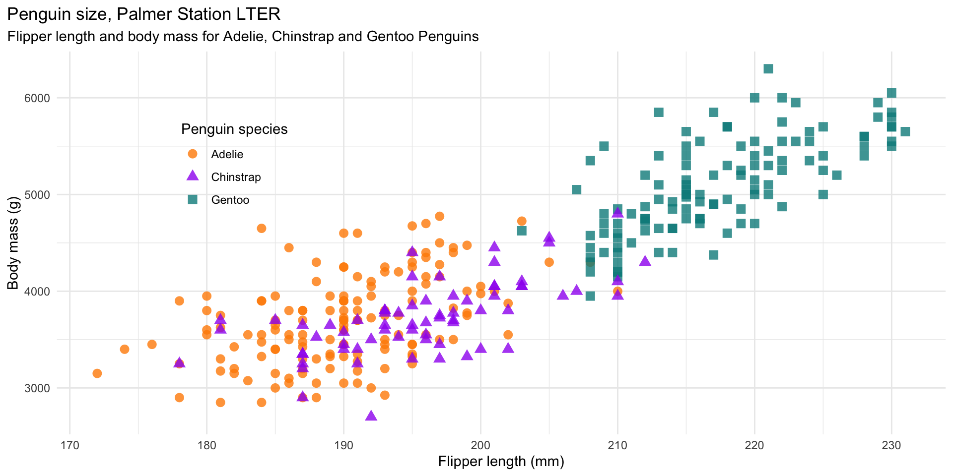
Interactivity
Quarto supports JupyterWidgets (with Jupyter) or htmlwidgets in R/knitr
Observable.js
Quarto includes native support for Observable JS, a set of enhancements to vanilla JavaScript created by Mike Bostock (also the author of D3). Observable JS is distinguished by its reactive runtime, which is especially well suited for interactive data exploration and analysis.
viewof bill_length_min = Inputs.range(
  [32, 50],
  {value: 35, step: 1, label: "Bill length (min):"}
)
viewof islands = Inputs.checkbox(
  ["Torgersen", "Biscoe", "Dream"],
  { value: ["Torgersen", "Biscoe"],
    label: "Islands:"
  }
)ggiraph
Example from Claus Wilke
library(tidyverse)
library(sf)
library(ggiraph)
library(glue)
library(cowplot)

texas_income <- readRDS(url("https://wilkelab.org/SDS375/datasets/Texas_income.rds")) %>%
  select(-county)
US_census <- read_csv("https://wilkelab.org/SDS375/datasets/US_census.csv")
tx_census <- US_census %>%
  filter(state == "Texas") %>%
  select(FIPS, name, pop2010, area) %>%
  extract(name, "county", regex = "(.+) County") %>%
  mutate(
    FIPS = as.character(FIPS),
    popratio = pop2010/median(pop2010),
  )
texas_counties <- left_join(texas_income, tx_census, by = "FIPS")
ggiraph
texas_scatter <- texas_counties %>%
  ggplot(aes(pop2010, median_income)) +
  geom_point_interactive(
    aes(
      tooltip = county,
      data_id = county
    ),
    na.rm = TRUE, size = 3
  ) +
  scale_x_log10() +
  theme_bw()
# then make the map
texas_county_map <- texas_counties %>%
  ggplot() +
  geom_sf_interactive(
    aes(
      tooltip = county,
      data_id = county
    ),
    size = 0.2, color = "black"
  ) +
theme_void()ggiraph
Tables
gt + gtExtras
With the gt package, anyone can make wonderful-looking tables using the R programming language. The gt philosophy: we can construct a wide variety of useful tables with a cohesive set of table parts. These include the table header, the stub, the column labels and spanner column labels, the table body, and the table footer.
gt, a Grammar of Tables
gt
library(dplyr, warn.conflicts = FALSE)
library(gt)
library(gtExtras)
library(gtsummary)

head(mtcars) |>
  gt() |>
  tab_options(
    table.font.size = px(40), #< because I've made the slides a lot bigger
    column_labels.font.size = px(45) #< normally don't have to increase this
)| mpg | cyl | disp | hp | drat | wt | qsec | vs | am | gear | carb |
|---|---|---|---|---|---|---|---|---|---|---|
| 21.0 | 6 | 160 | 110 | 3.90 | 2.620 | 16.46 | 0 | 1 | 4 | 4 |
| 21.0 | 6 | 160 | 110 | 3.90 | 2.875 | 17.02 | 0 | 1 | 4 | 4 |
| 22.8 | 4 | 108 | 93 | 3.85 | 2.320 | 18.61 | 1 | 1 | 4 | 1 |
| 21.4 | 6 | 258 | 110 | 3.08 | 3.215 | 19.44 | 1 | 0 | 3 | 1 |
| 18.7 | 8 | 360 | 175 | 3.15 | 3.440 | 17.02 | 0 | 0 | 3 | 2 |
| 18.1 | 6 | 225 | 105 | 2.76 | 3.460 | 20.22 | 1 | 0 | 3 | 1 |
gt extension packages
gtExtras
gtExtrasprovides additional helper functions togt, mainly themes and inline plotting
gtsummary

gtsummaryextendsgtto descriptive statistics and statistical summaries of models
gtsummary
- Comes with built in example datasets like
trial
Rows: 200
Columns: 3
$ trt   <chr> "Drug A", "Drug B", "Drug A", "Drug A", "Drug A", "Drug B", "Dru…
$ age   <dbl> 23, 9, 31, NA, 51, 39, 37, 32, 31, 34, 42, 63, 54, 21, 48, 71, 3…
$ grade <fct> II, I, II, III, III, I, II, I, II, I, III, I, III, I, I, III, II…Create a summary
penguins <- palmerpenguins::penguins

penguin_sum <- penguins |>
  na.omit() |>
  group_by(species, sex) |>
  summarise(
    n = n(),
    bill_len = mean(bill_length_mm),
    plt_bill = list(bill_length_mm),
    mass = mean(body_mass_g),
    plt_mass = list(body_mass_g),
    .groups = "drop"
  ) |>
  arrange(species, desc(bill_len))

penguin_sum
# A tibble: 6 × 7
species sex n bill_len plt_bill mass plt_mass
<fct> <fct> <int> <dbl> <list> <dbl> <list>
1 Adelie male 73 40.4 <dbl [73]> 4043. <int [73]>
2 Adelie female 73 37.3 <dbl [73]> 3369. <int [73]>
3 Chinstrap male 34 51.1 <dbl [34]> 3939. <int [34]>
4 Chinstrap female 34 46.6 <dbl [34]> 3527. <int [34]>
5 Gentoo male 61 49.5 <dbl [61]> 5485. <int [61]>
6 Gentoo female 58 45.6 <dbl [58]> 4680. <int [58]>gtExtras
```{r}
#| output-location: slide
#| fig-width: 10
gt(penguin_sum) |>
  gt_plt_dist(
    plt_bill,
    line_color = "#447099",
    fill = "#75aadb",
    fig_dim = c(15, 50)
    ) |>
  gt_plt_dist(
    plt_mass,
    line_color = "#447099",
    fill = "#75aadb"
    ) |>
  gt_add_divider(
    c(bill_len, mass), "left",
    weight = px(1), color = "#d3d3d3"
    ) |>
  cols_align("left", species) |>
  text_transform(
    cells_body(sex),
    fn = function(x){
      sex_planet <- ifelse(x == "male", "mars", "venus")

      purrr::map(
        sex_planet,
        ~fontawesome::fa(
          .x, height = "45px",
          fill = ifelse(.x =="mars", "#7fbf7b", "#af8dc3")))
                 }) |>
  gt_theme_nytimes() |>
  tab_options(data_row.padding = px(2),
              table.font.size = px(40),
              column_labels.font.size = px(35))
```
gtExtras
| species | sex | n | bill_len | plt_bill | mass | plt_mass |
|---|---|---|---|---|---|---|
| Adelie | 73 | 40.39041 | 4043.493 | |||
| Adelie | 73 | 37.25753 | 3368.836 | |||
| Chinstrap | 34 | 51.09412 | 3938.971 | |||
| Chinstrap | 34 | 46.57353 | 3527.206 | |||
| Gentoo | 61 | 49.47377 | 5484.836 | |||
| Gentoo | 58 | 45.56379 | 4679.741 |
gtExtras
Original: https://twitter.com/thomas_mock/status/1442541043019390982?s=20&t=0JewnMHkYrfPrYosfE2XIg
party_df <- tibble(
  Party = c("SPD", "CDU/CSU", "Greens", "FDP", "AfD", "Left", "Other"),
  Seats = c(206, 196, 118, 92, 83, 39, 1),
  `% of 2nd Votes` = c(25.7, 24.1, 14.8, 11.5, 10.3, 4.9, 8.7)
)

minimal_table <- gt(party_df) %>%
  gtExtras::gt_plt_dot(column = Seats, category_column = Party,  max_value = 379,
    palette = c("#ec323f", "black", "#63d64a", "#fff24e", "#4fabf7", "#e956ad", "grey")) %>%
  gtExtras::gt_theme_nytimes() %>%
  gt::tab_header(title = "Results by Party in the Bundestag Election",
             subtitle = "Seats and votes are based on provisional official results.") %>%
  gt::cols_width(Party ~ px(300), 3 ~ px(30))
gtExtras

Your Turn
- Open
quarto-workshop/07-static/gt-summary.qmd - Open
quarto-workshop/07-static/stat-html.qmd - Explore and render

